Overview
The Text Input component allows users to input text within your application, with options for configuring default values, placeholder text, labels, additional add-ons and customizing it for enhanced user guidance. This guide provides a detailed overview of configuring and personalizing the Text Input component.
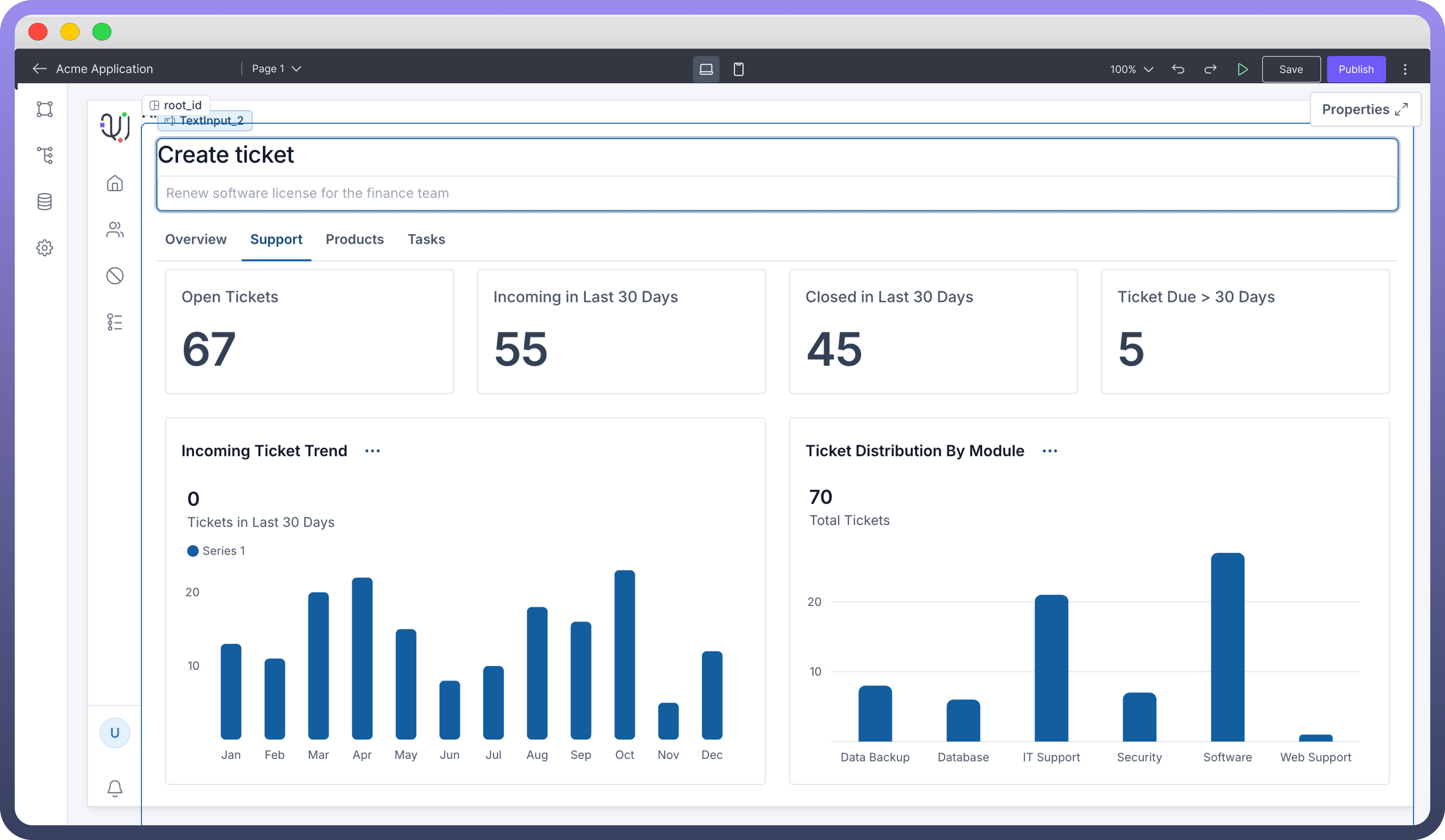
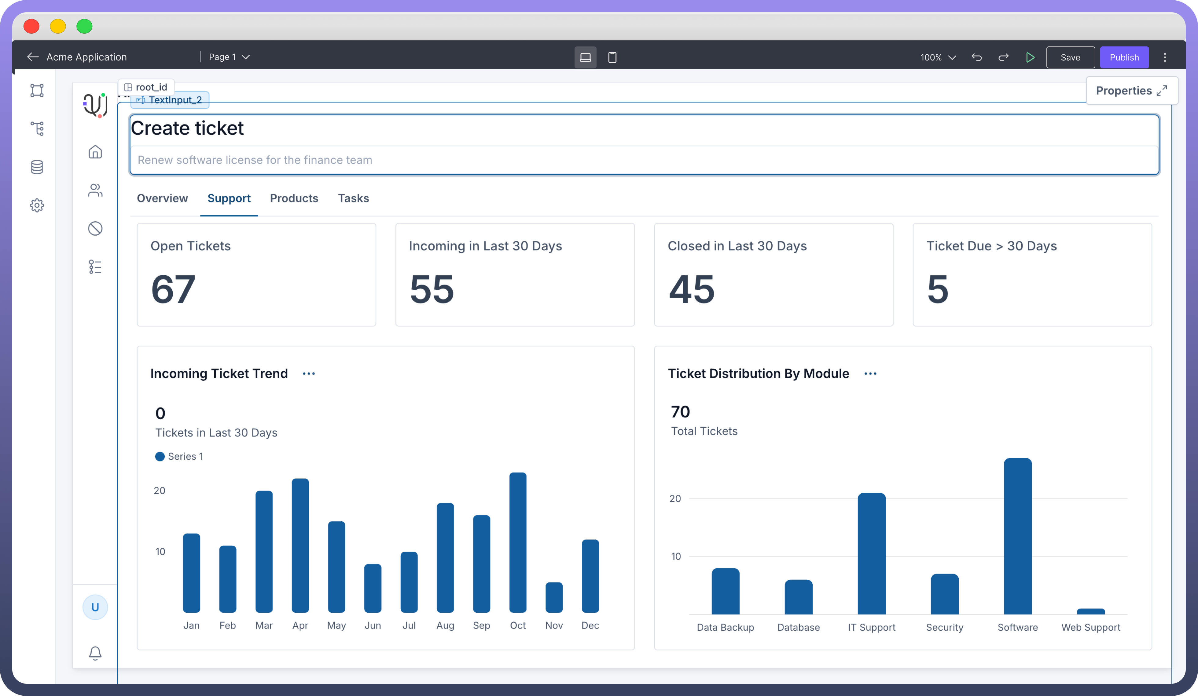
Configuring the Text Input Component
Once the Text Input component is added, you can configure its properties through the right-side configuration panel.

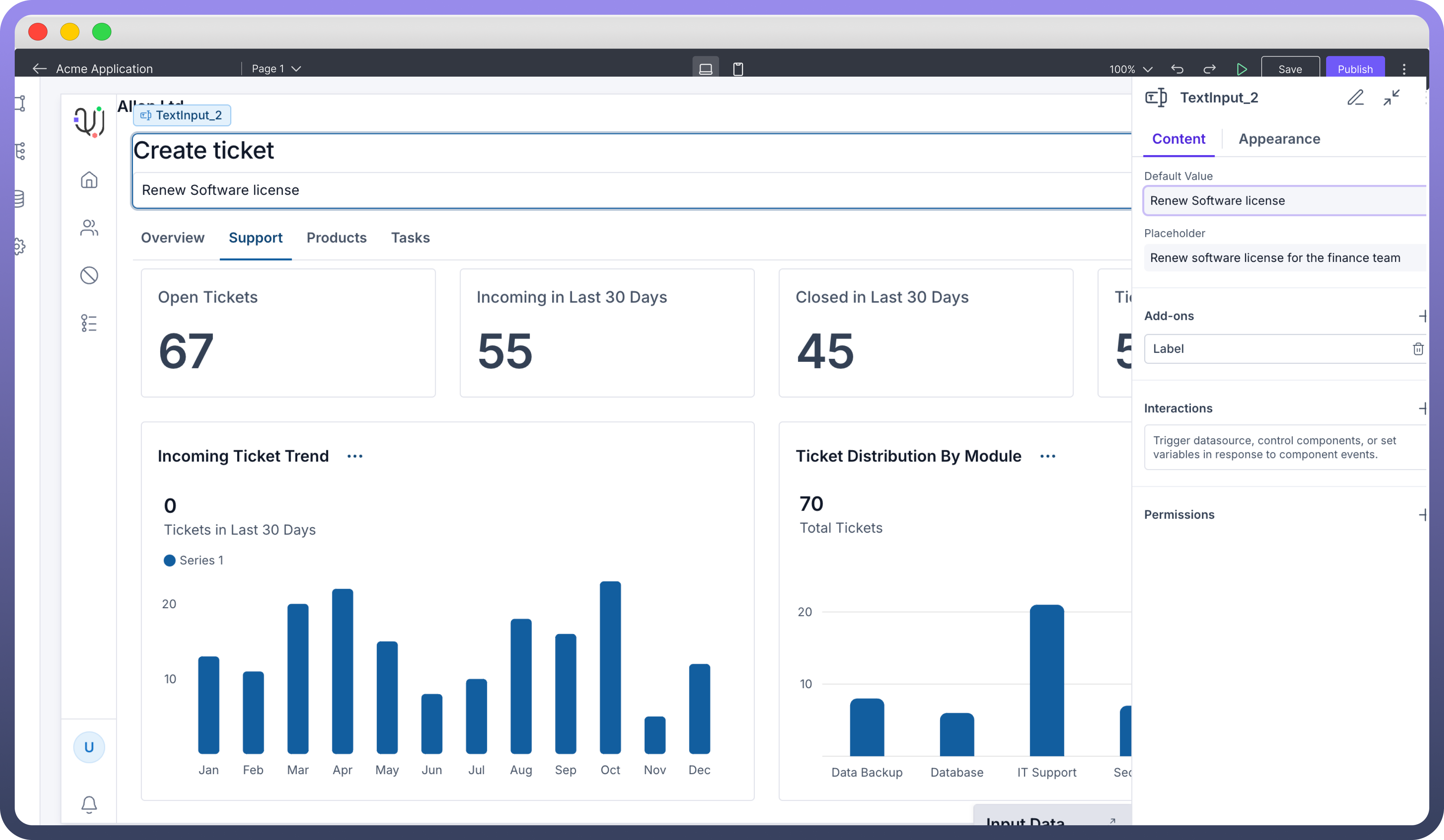
Setting Content and Text Input options
Default Value: Set an initial text that appears in the field when it loads, providing an example or suggested entry.
Placeholder: Add a short hint to guide users on what to enter. This text disappears once typing begins.
Additional Add-Ons
Under the "Add-ons" section, you can add elements to guide users with extra context and clarity around the Text Input.
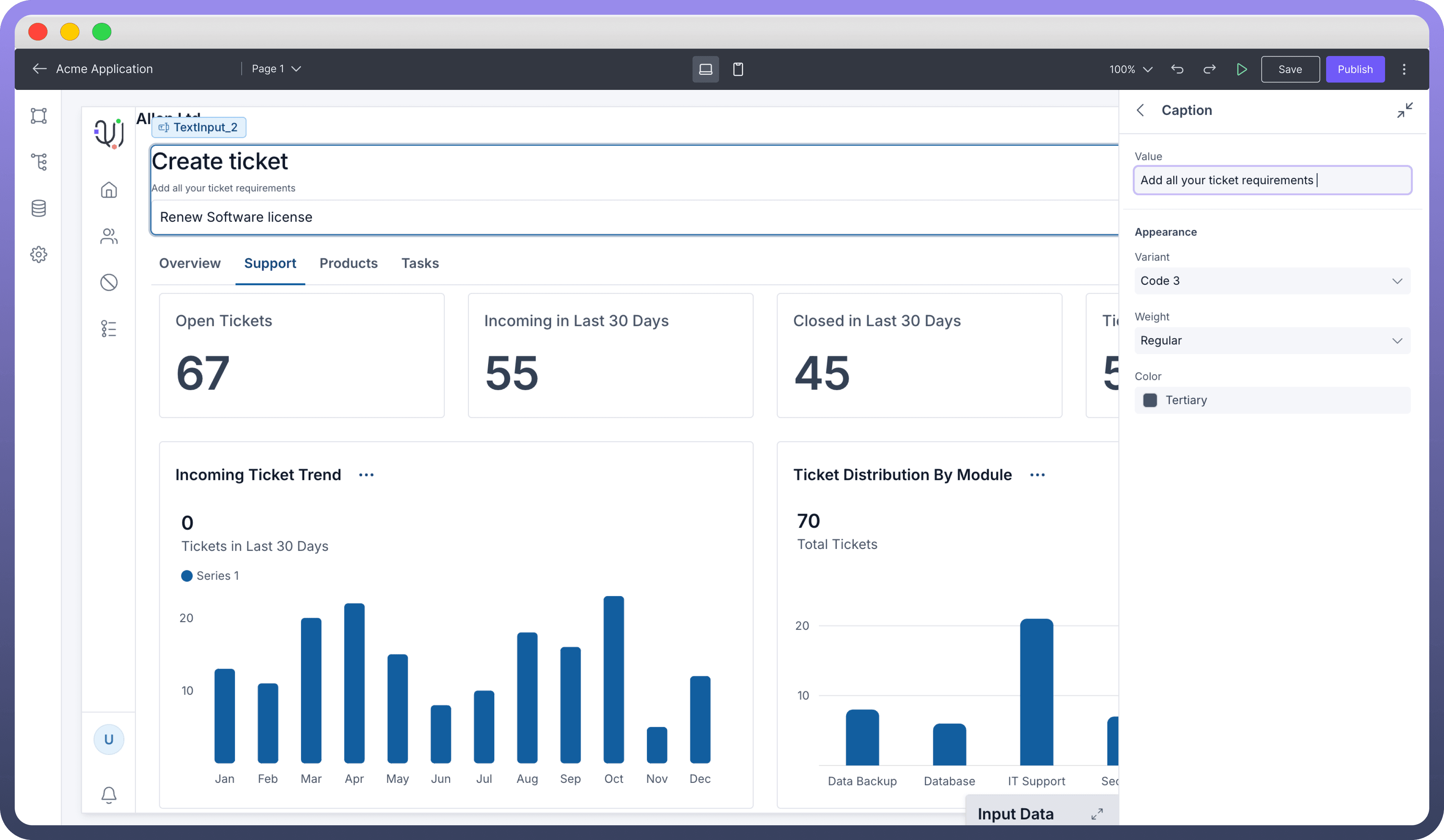
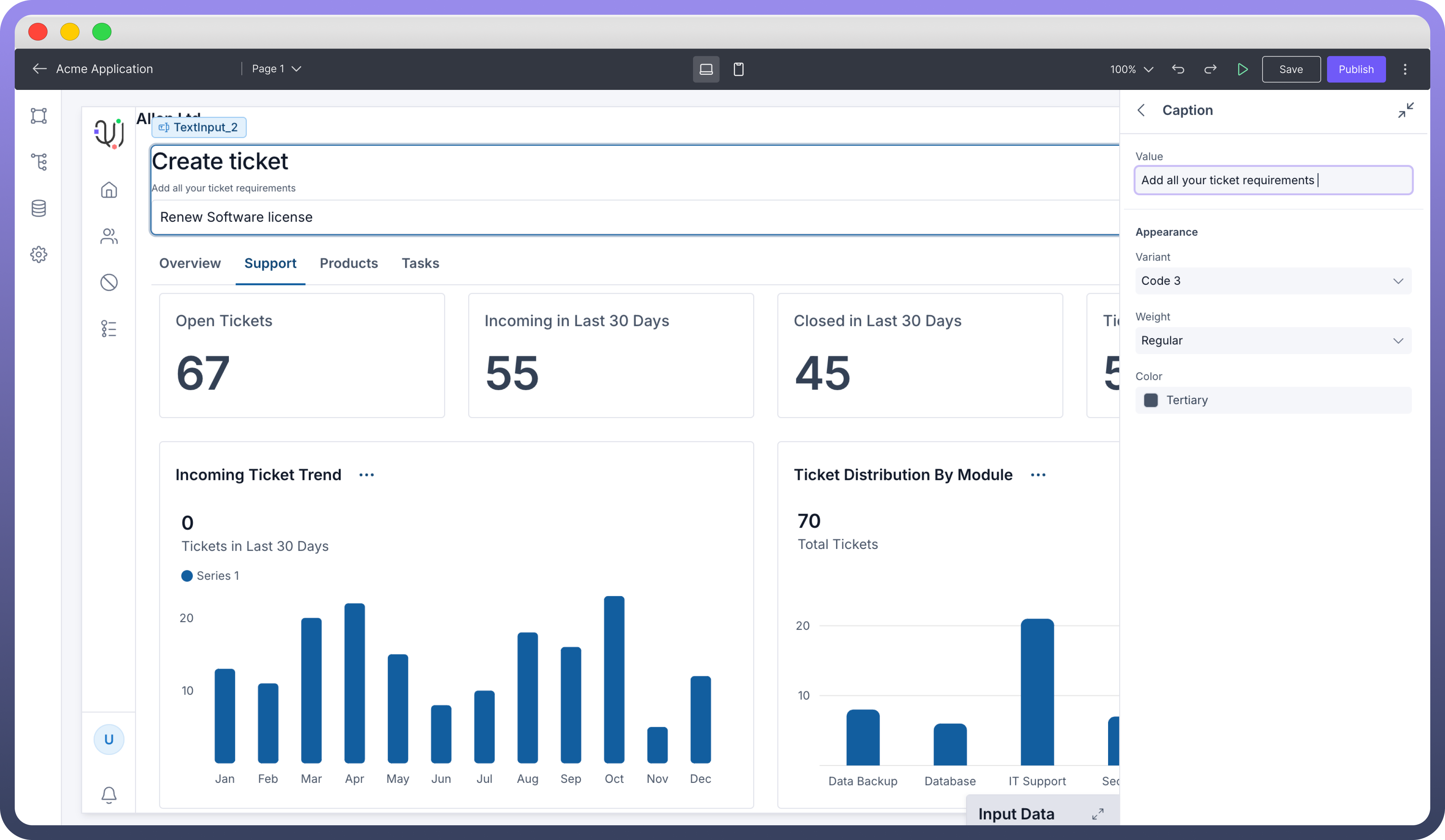
Label: Appears above the input to describe what users should enter.Caption: Adds a brief note below the field for additional guidance.Prefix: An icon at the start of the input, e.g., currency symbols.Suffix: An icon at the end, e.g., units or indicators.
Best Practices for Using Text Input Component
Use clear Labels: Provide concise, descriptive labels above the input field to help users understand exactly what information is required.
Keep Placeholders short: Offer brief but helpful placeholder text inside the input field, giving users a quick hint about what to enter
Add Captions if needed: Include a short caption below the input field to clarify specific requirements or add extra instructions when needed.
Use relevant Icons: Choose Prefix or Suffix icons that clearly relate to the type of input, like currency symbols or units, to add visual guidance and context for users.


