
Overview
The Modal component allows users to create pop-up dialogs that can display information, prompt user actions, or gather input. Modals are an essential UI element for creating interactive and dynamic applications.
Configure Card Modal
In the Card Variant, the modal appears on the screen like a card, integrated into the main page.
Users can add components directly within this card-like modal. This variant is particularly useful for displaying smaller, self-contained content and interactions.
You can configure a Card Modal by following the below steps:
Add Modal from the component list to your canvas.
By default, the added Modal will be of Card Type. You can find it under Variant in the properties section.
Add Components in Modal like you add in a Card Component in 3 Different Slots of
Header,Body&Footer.
Refer
Check Card Component’s article to know in detail about adding components in a card.
.png&w=1080&q=75)
.png)
Configure Page Modal
This variant allows users to select and render an entire page inside the modal. Users need to navigate to the selected page to create and configure the content that will be displayed within the modal.
.png&w=1080&q=75)
.png)
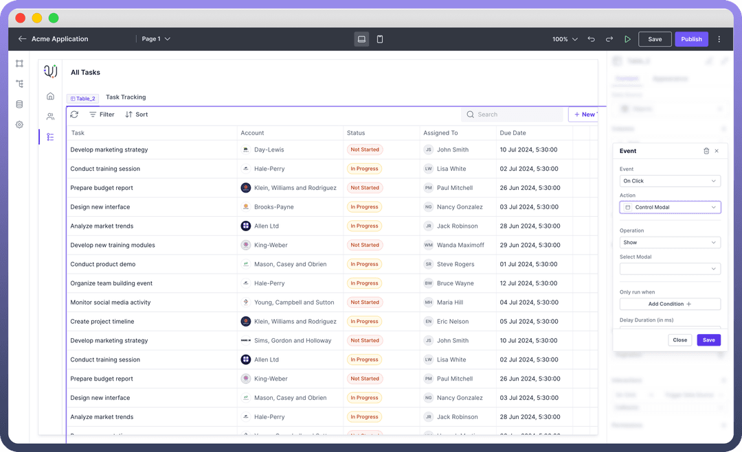
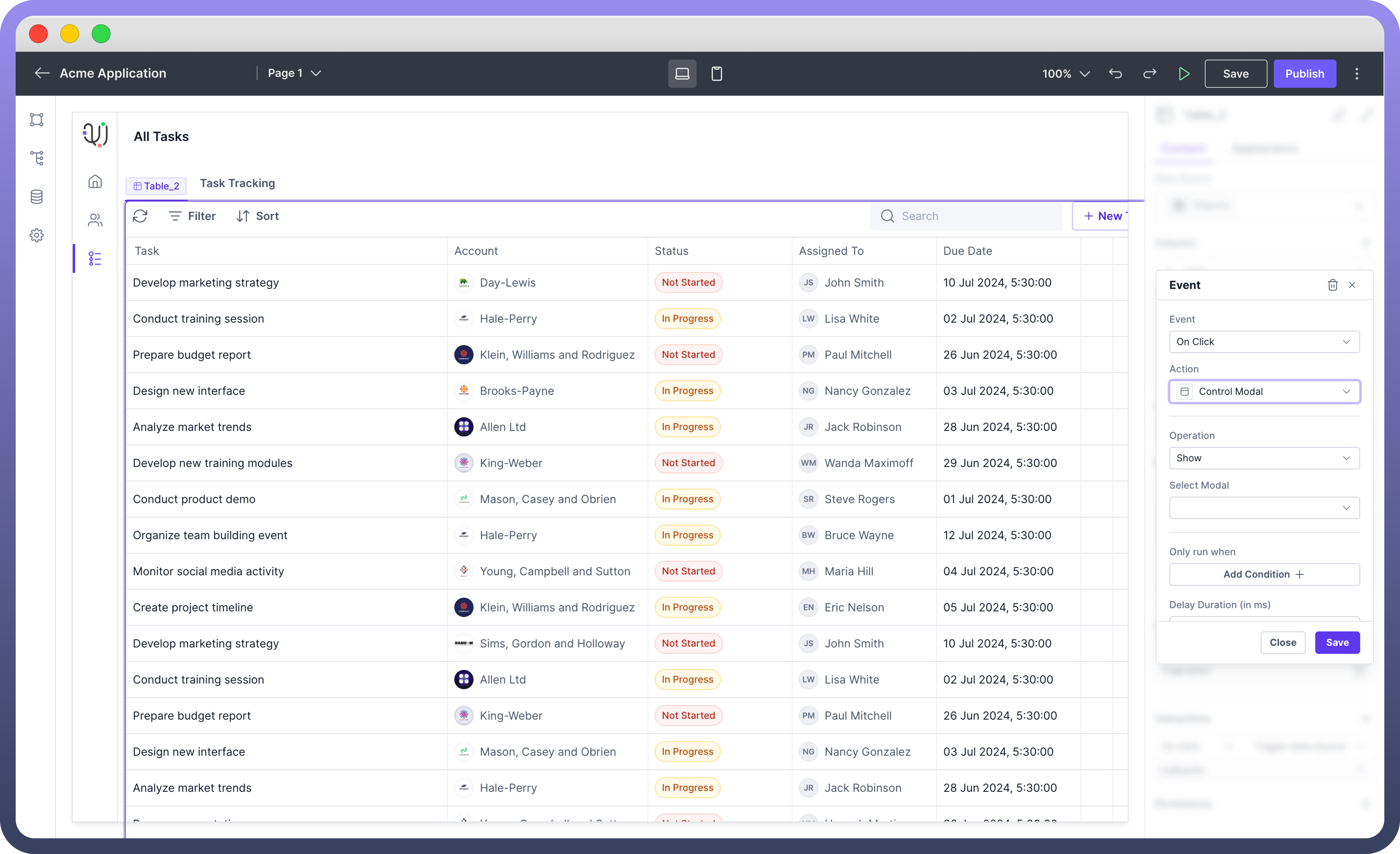
Open & Close Modals
Opening & Closing of Modal is defined in the Interaction section. Modal is triggered by the interaction defined in other components. To define opening of a modal, follow the below steps:
Add Interaction: Select a component (e.g., button) that will trigger the modal to open.
Configure Interaction: Set the interaction action to "
Control Modal".Specify Operation: Choose "
Show" or “Hide” to control visibility of the modal when the triggering component is activated.

Note
You can also define events like On Close where you can mention the actions or workflows that should be performed when the modal is closed, such as resetting forms or updating data.
Appearance Customization
| Property | Description |
Height | Set the vertical size of the modal to control how much space it occupies on the screen. |
Width | Adjust the horizontal size of the modal to fit the desired content width. |
Padding | Define the internal space between the content and the modal's border |
Height | Sets the overall height of the modal component. |
Min-Height | Sets the minimum height of the modal component. |
Max-Height | Defines the maximum height the modal component can expand to. |
Width | Sets the overall width of the modal component. |
Min Width | Specifies the minimum width the tab component can shrink to. |
Max Width | Defines the maximum width the tab component can expand to. |
Permissions
The Modal component allows you to set visibility permissions based on the permissions granted to the logged-in user. This ensures that only authorized users can view or interact with the modal.
Refer
You can refer to Permissions article to know more about defining permissions for each component.