Overview
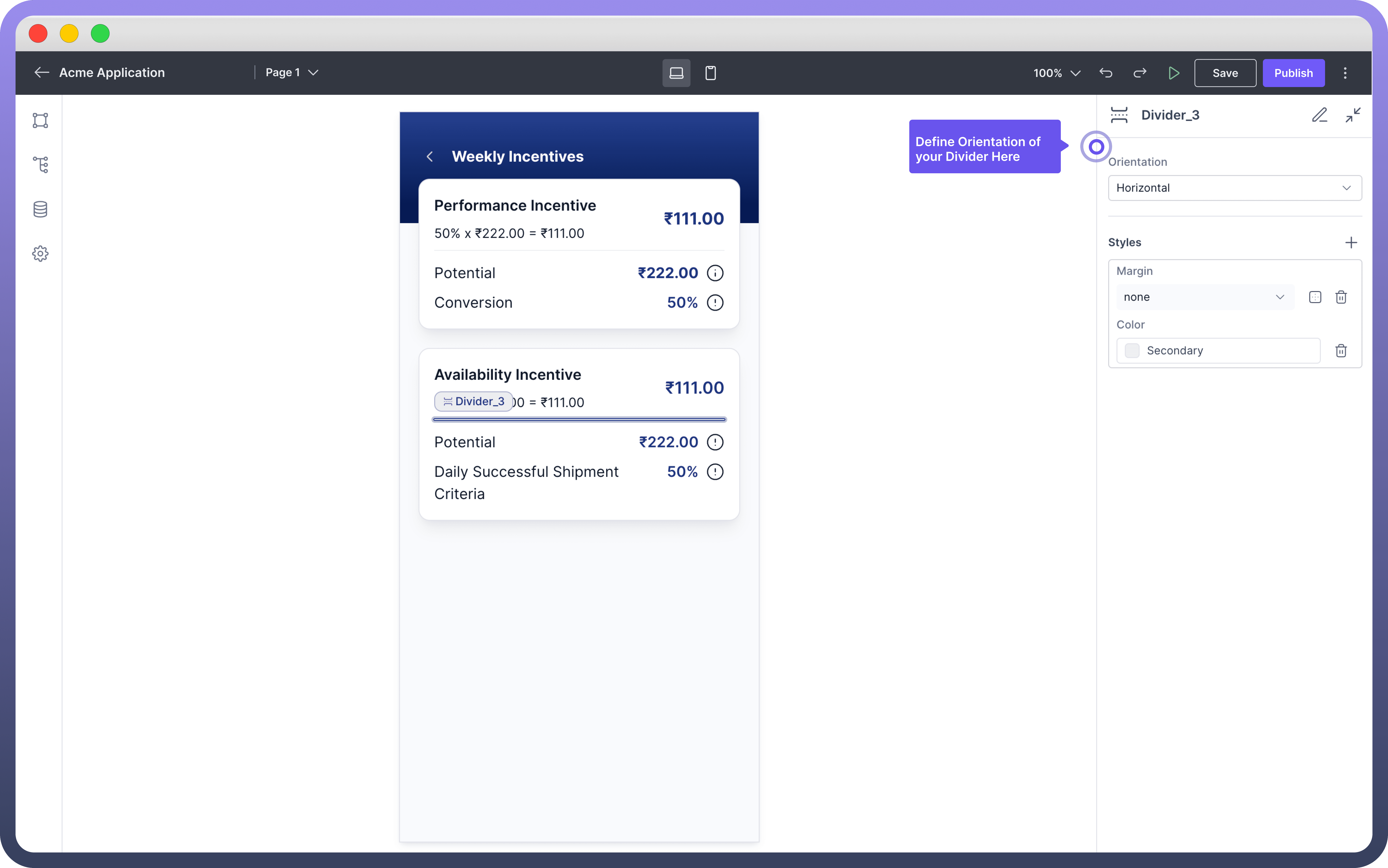
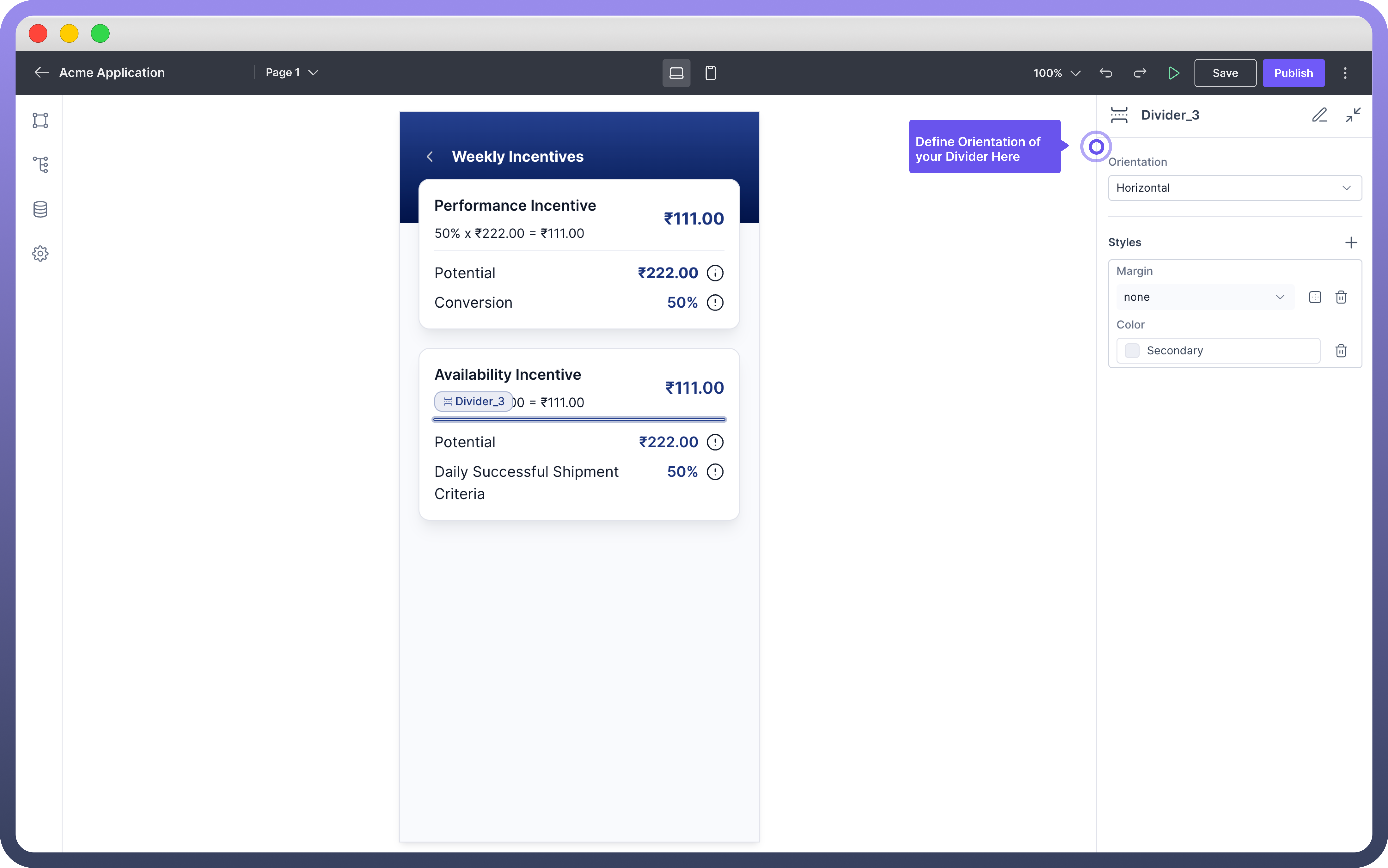
Divider component is used to visually separate or group content within your application. It adds a horizontal or a vertical line in the canvas.
This article will outline how to add, configure, and style the Divider component to suit your application's needs.


Add Vertical Divider
You can change the orientation of the divider under the properties section.
Divider supports two orientations - Vertical & Horizontal.
To add Vertical Divider:
Add Divider from the component list to your canvas.
Choose the divider and change its orientation to vertical in the properties section.
Appearance Customization
You can define various styles to the Divider Component.
Property | Description |
| Add custom margins to separate the Divider from adjacent components. Options can be defined using standard CSS margin values (e.g., `10px`, `1em`, etc.) |
| Choose a color from the palette. You can also add Conditional Coloring. |
| Define height for the divider. |
| Define width for the divider. |
| Defines the minimum height of the divider |
| Defines the minimum width of the divider |
| Defines the maximum height of the divider |
| Defines the maximum Width of the divider |


