
Overview
The Calendar component is a date-picker widget that allows users to view and select dates in a calendar format. It's essential for applications requiring date selection functionality, such as booking systems, scheduling interfaces, or any form that needs date input. The component offers month-year navigation and a grid-based date display for date selection.
Configuring Key Properties of Calendar
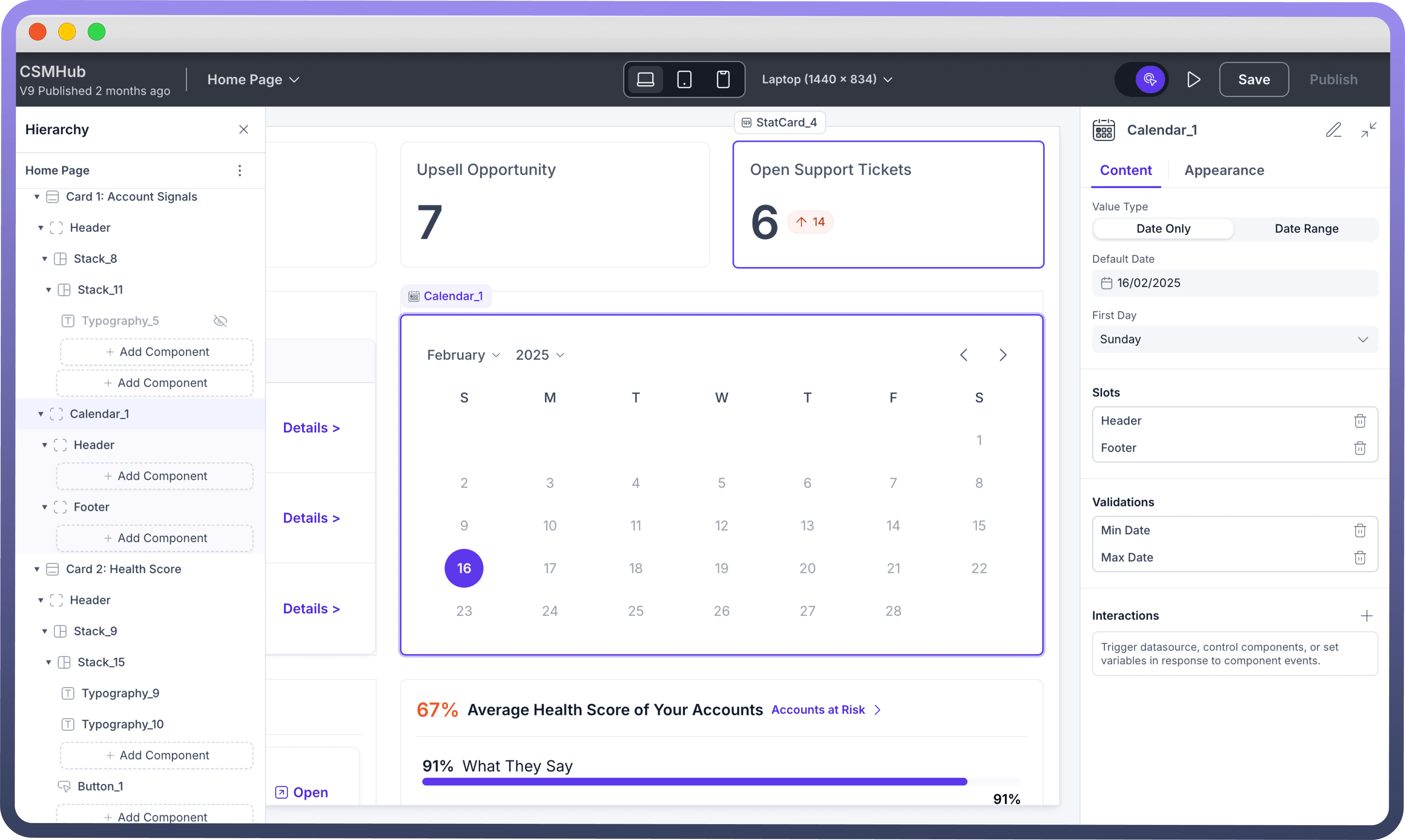
Value Types
Choose between single date or date range selection based on your application needs:
Date Only: Allows selection of a single dateDate Range: Enables selection of a start and end date, creating a date span
Default Date
Configure the initial date selection through the Content tab in MM/DD/YYYY format (e.g., 02/15/2025).
First Day Settings
Choose which day starts your week (Sunday/Monday) using the "First Day" dropdown

Note
By default first day is set as Monday.
Slots Customization
Header Slot
Default header displays "
Calendar" textAdd custom components via "
Add Component" in Header sectionUseful for adding titles, icons, or additional controls
Footer Slot
Optional area below calendar grid
Add components through "
Add Component" in Footer sectionIdeal for action buttons or supplementary information
Validation Settings
Set date constraints by specifying minimum and maximum selectable dates to control user input and ensure date selections fall within allowed ranges.
Min Date: Set earliest selectable dateMax Date: Set latest selectable date
Interactions
Calendar supports On Change events. On Change triggers an action when a date or date range is selected. You can use this functionality to trigger data sources, set variables with the selected date/date range, or execute specific automations based on the date selection.
Note
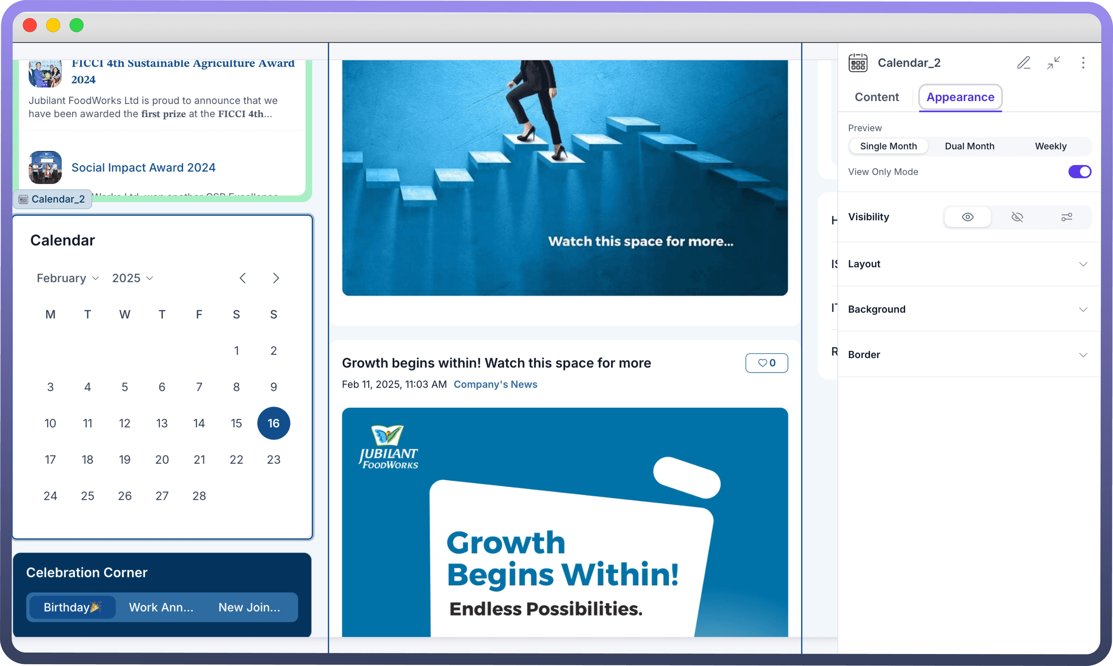
Enable View Only mode to make the calendar non-selectable, useful when you want to display dates without allowing user interaction.
Appearance
Choose how your calendar is displayed to users with three different view options:
Single Month: Traditional one-month view for basic date selectionDual Month: Side-by-side view of two consecutive months, ideal for date range selectionWeekly: Compact week-based view for focused scheduling and short-term planning.

Refer
You can refer to Appearance Settings documentation to know more about defining Layout for each component.


