
Overview
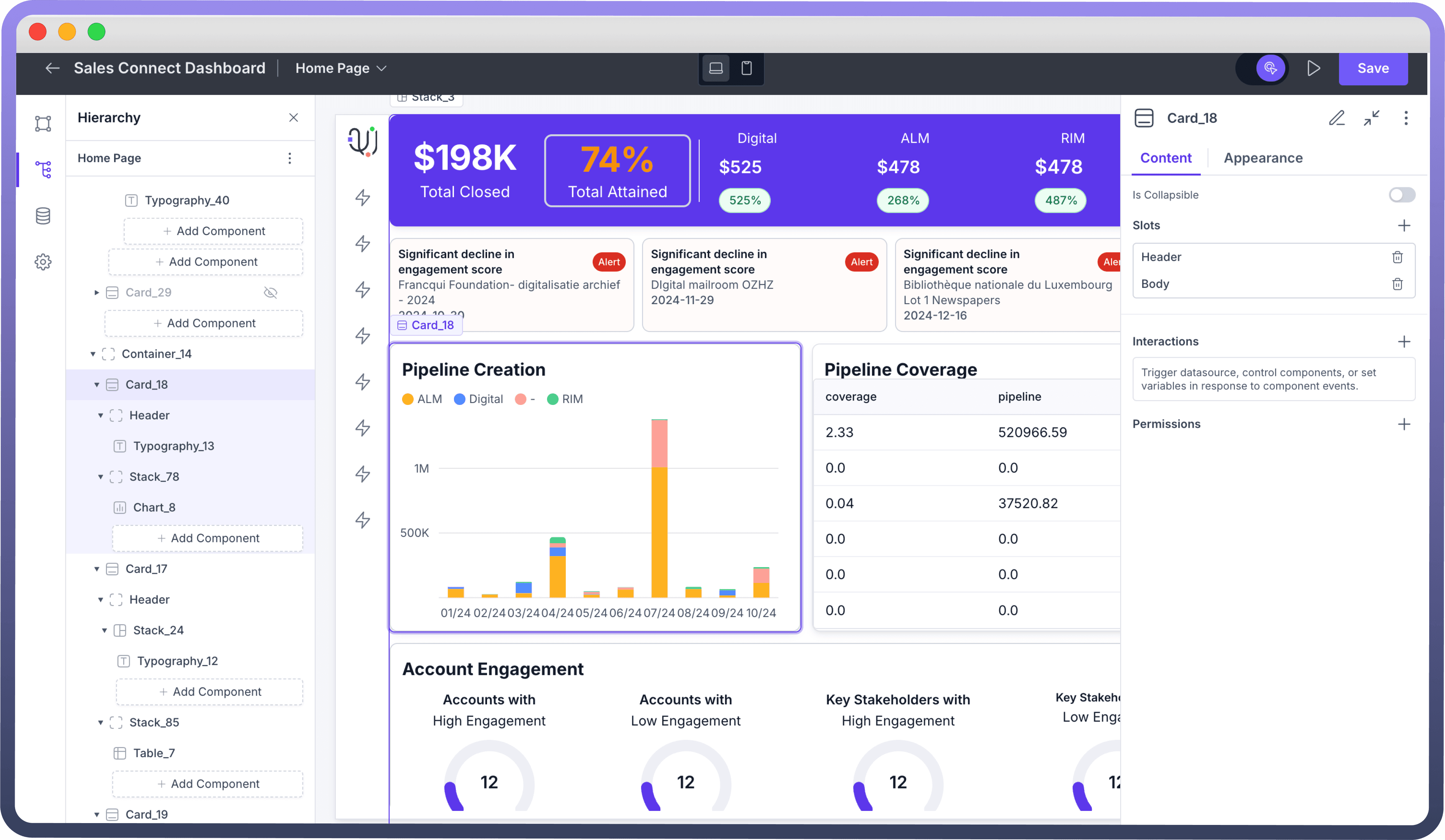
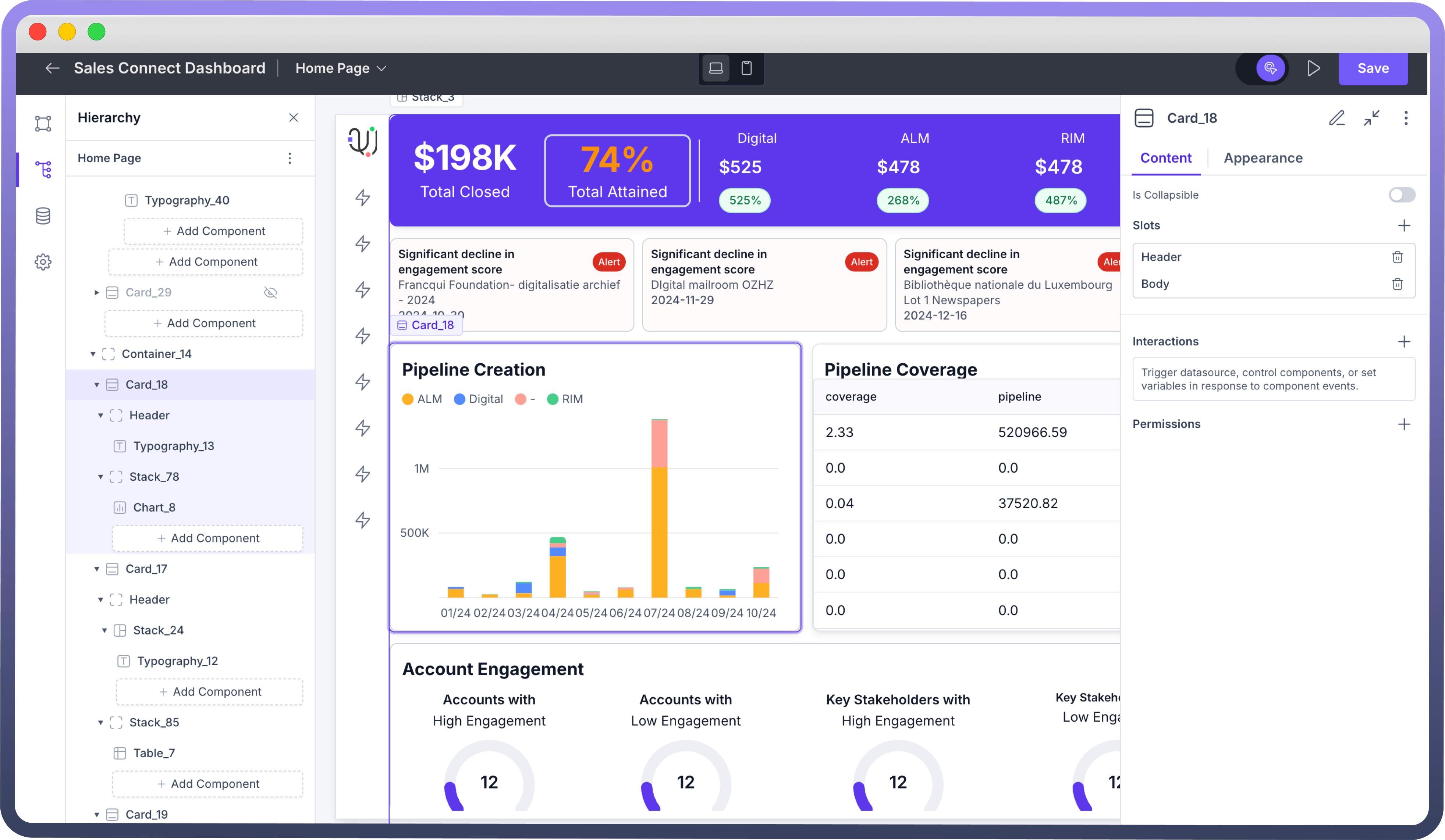
The Card is used for creating widgets and complex layouts. It consists of 2 main sections: a Header and a Body. The Header appears at the top of the card, while the Body covers the remaining space. We can also add a footer to the card if needed. Additionally, the Card has a border by default, giving it a widget-like appearance.
Key Properties
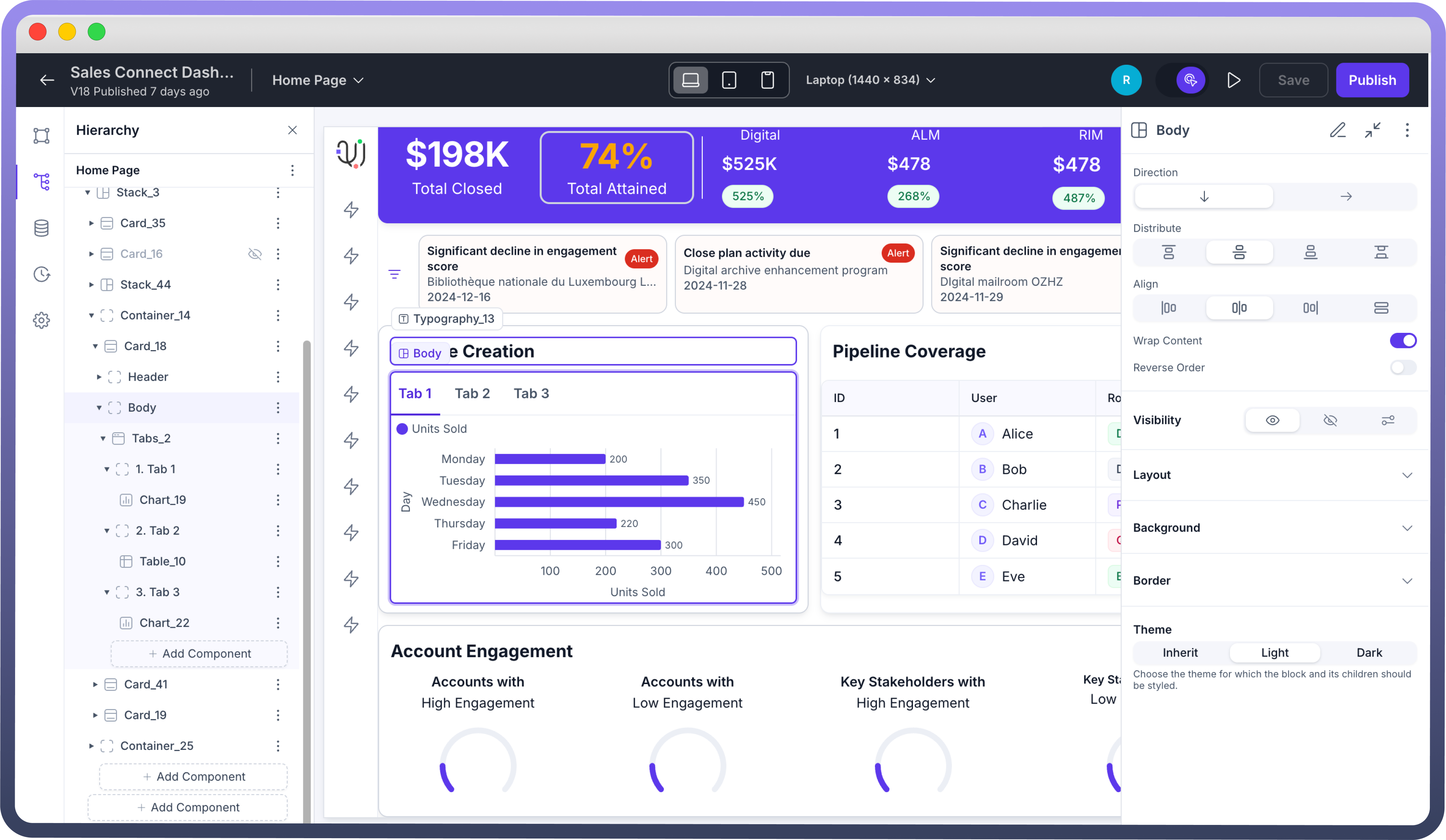
Header and Body: The Card’s Header and Body work like the Stack component, supporting direction and alignment for precise content organization.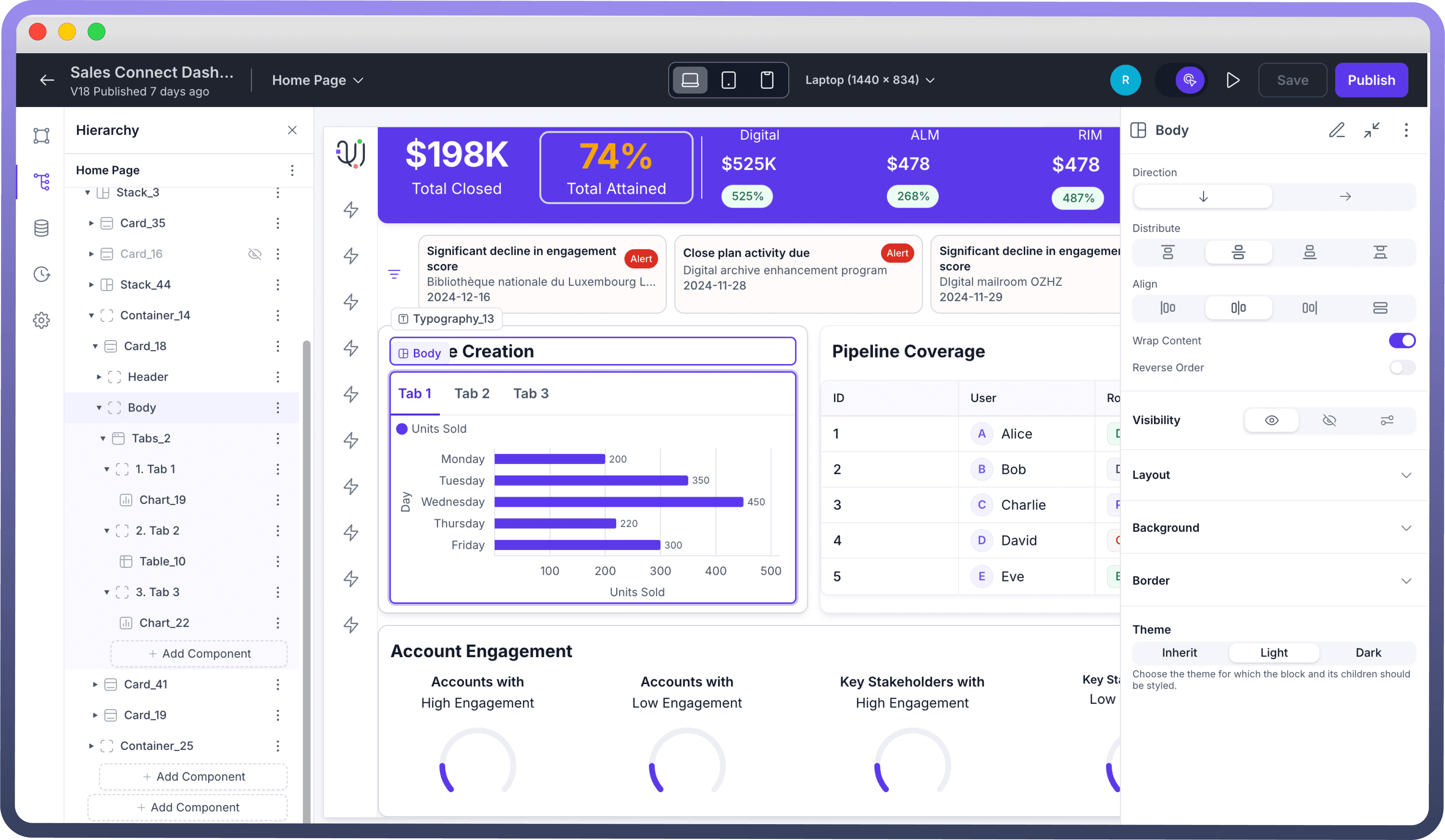

Refer
You can refer to the Stacks Article for the same.
Collapsible: Cards can be made collapsible, so you can choose if they start open or closed.Interactions: Define the interactions that should occur when the card is clicked. Click the "+" button under "Interactions" to add a new interaction, such as triggering a data source or navigating to another page & many more.Refer
You can refer to the Interactions article for the same.
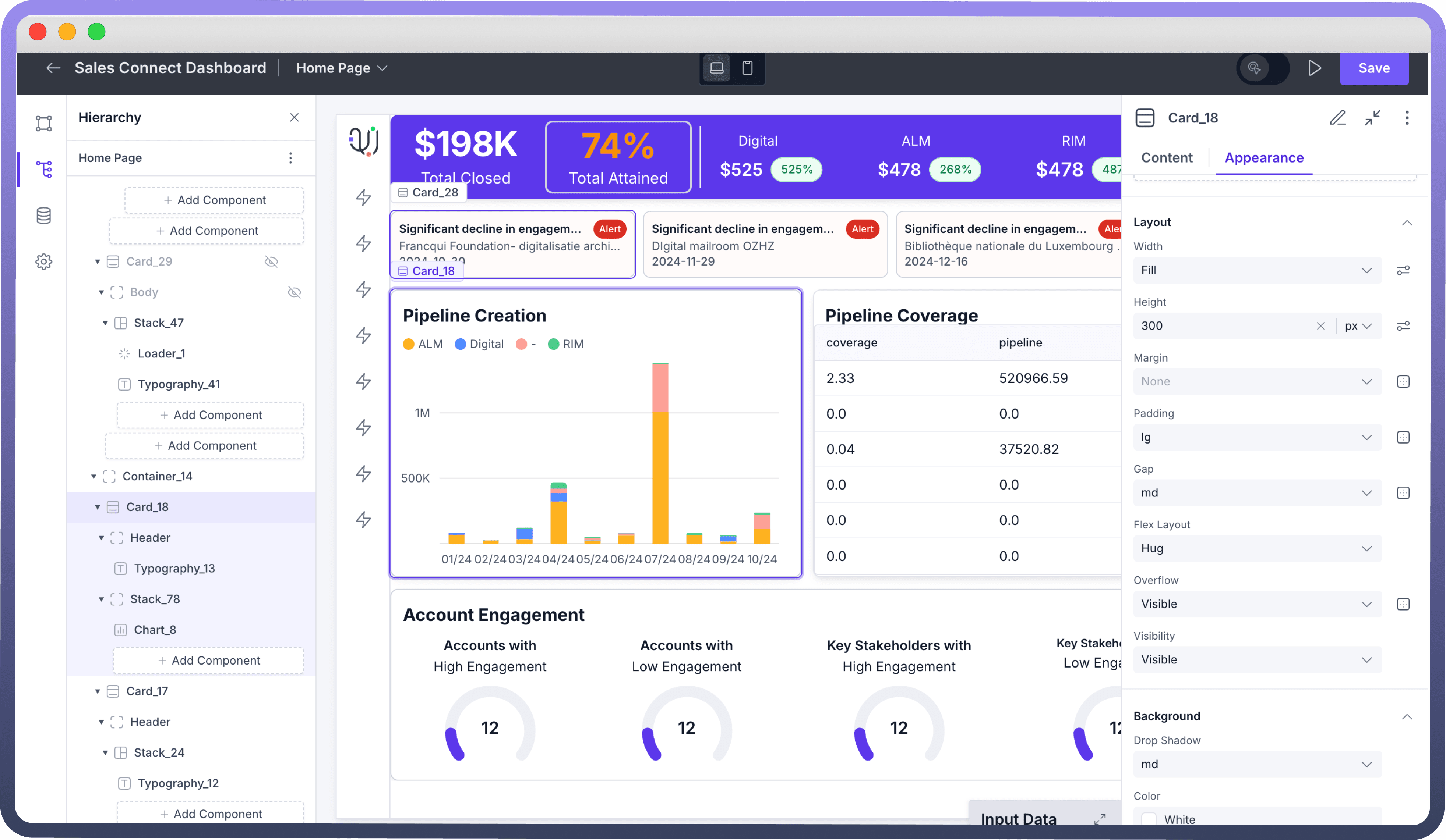
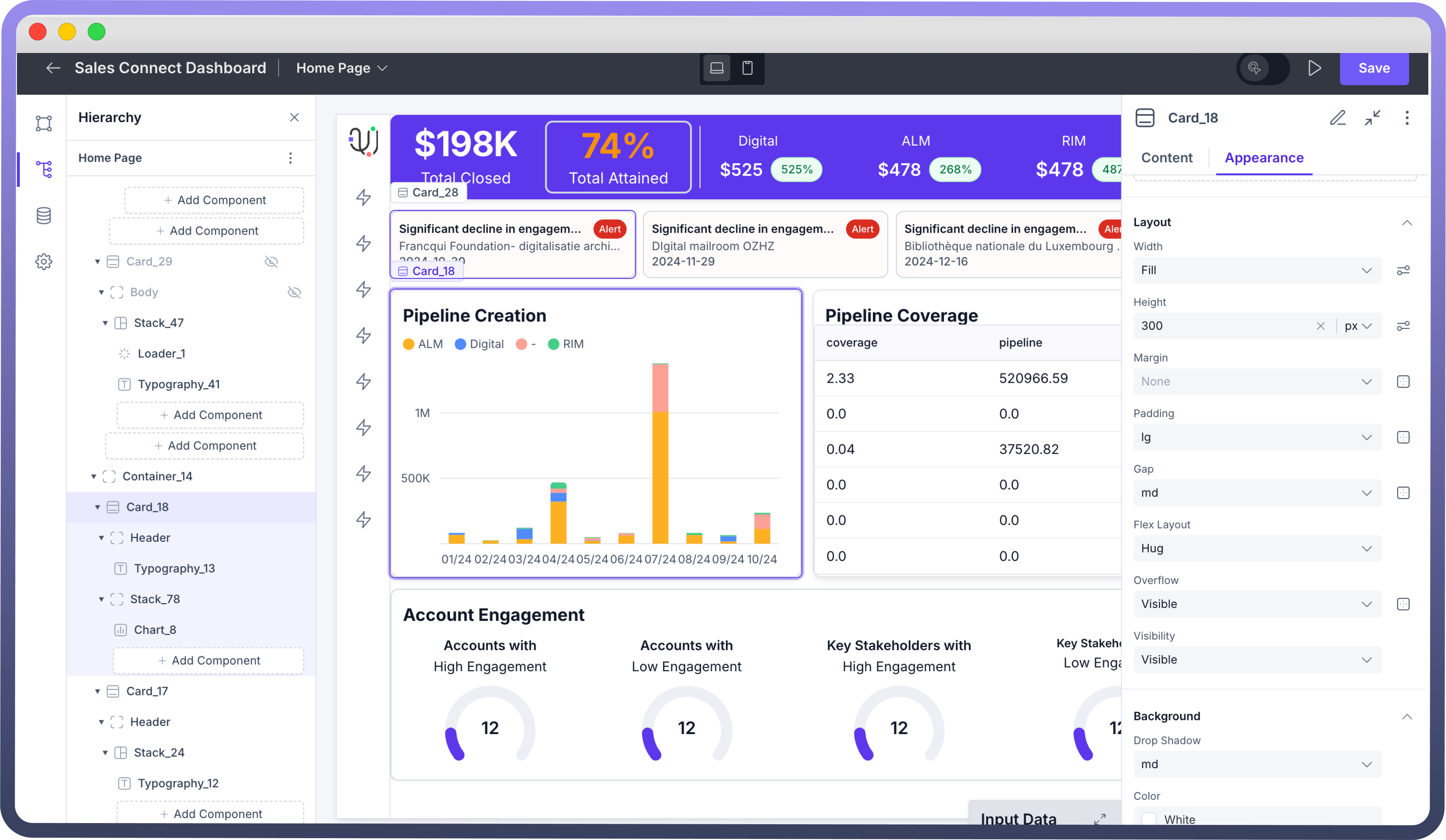
Configuring a Card
Select the Card component from the list from the left pane of the application.
By default, the Card includes a Header and Body section, where you can add various components.
The Card Header comes with a default state which contains a Typography component displaying "
Card title".Customize the "
On Click" behavior by adding interactions if needed.Adjust the Card's appearance and settings to fit your design requirements.
Appearance and Customization
Property | Description |
| This setting controls the divider line between the Header and Body; toggle it off to hide the line. |
| Specifies the theme styling for the Card and its components, with options typically including Light and Dark. |
| Sets the background color for the Card. Includes a range of color choices to match your design theme. |
| Defines the thickness of the Card’s border. Options typically include none, xs, mg, and xl, etc. |
Defining Permissions
The Card component allows you to set visibility permissions based on the permissions granted to the logged-in user. This ensures that only authorized users can view or interact with the Card.
Best Practices
Optimize for Readability and Focus: Use the Card's Header and Body sections to clearly organize information, with the most important details in the Header and supportive content in the Body.
Combine with Other Layout Components: Use Cards in combination with stacks and containers to create more complex and structured layouts.
Consistent Spacing: Utilize the Gap property to ensure consistent spacing between elements, providing a cleaner look.