
Overview
Button is an interactive component that performs an action when pressed. The Button component allows users to trigger actions, navigate pages, and interact with various data sources within the application.
Key Properties
Once the Button component is placed on the canvas, you can configure it with following key actions:
Text: Enter the label text for the button in the "
Text" field. This is the text that will be displayed on the button.Interactions: Define the interactions that should occur when the button is clicked. Click the "
+" button under "Interactions" to add a new interaction, such as triggering a data source or navigating to another page & many more.

Refer
You can refer to the Interactions Article for the same.
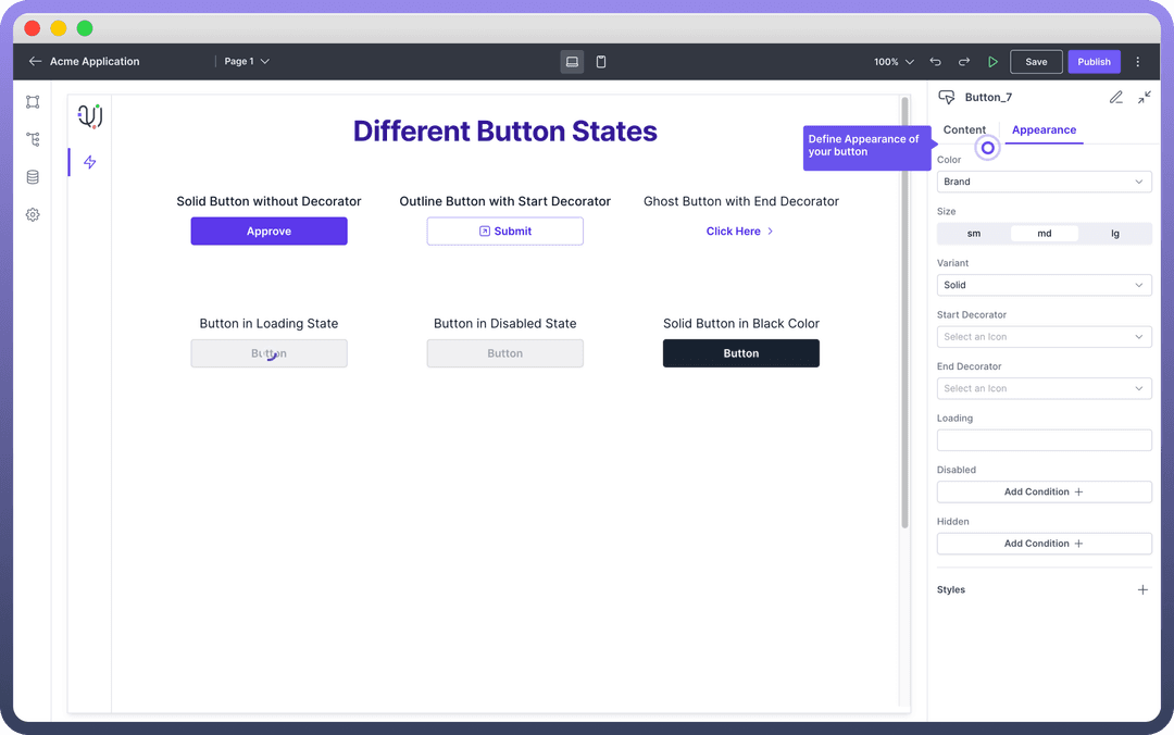
Appearance Customization
The Button component can be styled to match your application's design:
| Property | Description |
Color | Select the color from the "Color" dropdown. Options include brand colors, neutral (black) or danger color (red). |
Size | Choose the size of the button from the available options: small (sm), medium (md), or large (lg). |
Variant | Select the button variant from options like Solid (with background fill), Outline (with outline border), or Ghost (with just text). |
Decorators | Add icons to the start or end of the button text by selecting from the "Start Decorator" or "End Decorator" dropdowns. |
Width | Define width, minimum width & maximum width under styles. To define width, you need to click on the “+” icon under the "Styles" section. |
Add Loading State
The Loading State option allows you to indicate that a process is occurring after the button is clicked. This is useful for actions that take time to complete, such as submitting a form or fetching data from an API. The button will display this state until the action is completed.
Conditional Display
Set conditions to disable or hide the button based on specific criteria by using the "Add Condition" buttons under the "Disabled" and "Hidden" sections.
Disabled: Use the Disabled condition to make the button non-interactive based on specific criteria. For example, you can disable the button if a required form field is empty. To set this, click "
Add Condition" under the Disabled section and specify the condition.Hidden: The Hidden condition allows you to hide the button entirely based on certain conditions. For example, you might want to hide the button if a specific field in your application has a particular value. To configure this, click "
Add Condition" under the Hidden section and define the condition.
Tip
It is always recommended to implement loading and disable state to provide feedback to users. You can use data pills in your condition and write complex formulas like you would write in Excel.
Define Permissions
Every component allows you to set visibility permissions based on the permissions granted to the logged-in user. This ensures that only authorized users can view or interact with the button.
Refer
You can refer to the Permissions article for the same.